Comics I Love
ApokaFriends
Legal Mumbo Jumbo
This work is licensed under a Creative Commons Attribution-NonCommercial 2.5 License.This means you can do pretty much anything with these comics except sell them. Please link back when hotlinking images.
Who Makes This?
 Mike Gioia does. And my friends Jason, Alex, Theo and twin bro Anj help out. I'm 40 years old, live in New York City and have been drawing comics since high school. Check the about page for more info.


What Say You (21)
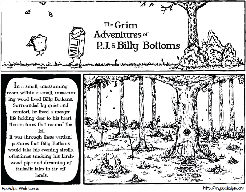
As a stand alone comic, I am not impressed. As a start to a picture book, I am quite impressed and would definitely keep reading.
@Jeremy: yea it's the beginning of a longer series.
It's pretty.
Nice, but... Where are the funnies?!
You might want to consider having a separate site for these stories. It just seems out of place when you put it in between Wikipedia Brown and inanimate object metaphors.
Hey Mike
Pretty Cool! Saw the article in the Daily Local. Did not know you had so much talent. I must have had you mixed up with Andrew!
I absolutely love that drawing, I agree it's different to your normal stuff but I would love to see more - just a lovely picture, great job!
I agree with FenixStryk. I like storyline webcomics, but I think you'd (and we'd) be better off if these were separated into a different menu on this site. Kinda like how the guy who does Ctrl Alt Del has his set up: http://cad-comic.com/
The clear answer;)
Yea I see what you guys are saying, that and it's kind of difficult to see the other parts of the story line this way. The next Wednesday will be this as it's already done and I'll be on vaycay but I'll get workin' on a separate page for these comics and put a little ad on this page about it when it updates.
Thanks for the insight guys!
Beautiful work with line art!
I like BB's home, though have a logistical issue with the size of his door- the placement of the handle suggests a door much too short for a carton of his stature. Unless you have him crouching in so as not to bump his head (also a satisfying solution)
:)
Thanks Pawel. and i know what you mean, the next one shows the door again and its much bigger haha. I didn't realize it until after I finished that it wasn't proportional. oh well sshhhhh
Fuck the haters. I like it.
Cool. Thanks for listening to reader feedback Mike:).
maybe it should be on it's own site. "Dreaming of far away lands" crap doesnt float. If I wanted that I'd read the hobbit. ghey and ghey.
So... where is this SUPPOSED to be going? To real 'happiness and joy' stuff, or will it have a tragically ironic end?
I vote for massive puns. The flying bread is addicted to alcohol, perhaps. Every night, he gets absolutely TOASTED!
The art and title suggest something that the content has not fulfilled. They have a somewhat well, grim look that the comic so far has not matched. I also agree it needs to be separated from your regular content.
Is it like The Hobbit? Not to be rude.
@Betty: yea the first three are kinda similar. I have the next 4 or 5 panels scoped out and it takes a much different direction. hopefully will finish 1.4 tonight.
i like this but....wouldn't the milk spoil after a while?
These 'grim adventures' do not make me lol.
Leave Some Love